If you've worked hard on your marketing campaign, you want to attract internet traffic and convince curious visitors of your brand. You do this by providing a landing page. Well-crafted landing pages persuade potential customers.
What are landing pages?
A landing page, what exactly is it? Simply put, it is a web page that forms an important part of your online marketing. They are often used for lead generation, which allows you to collect contact information from potential customers.Landing pages usually focus on one specific topic, product, or service. Because a landing page is meant to get potential or new customers to perform an action (such as signing up for a newsletter or purchasing a product), the content and layout of the page typically look simpler than a homepage.
A good landing page usually contains a clear action button with a Call-To-Action (CTA). This CTA should prompt customers to take a specific action.
Measuring is knowing
In addition, landing pages play a crucial role in analysing your marketing and advertising campaigns.As a marketer, you want to know - and therefore measure - how many visitors landed on the landing page and how many conversions it generated.
The conversion rate indicates how many visitors actually performed the desired action, in relation to the number of visitors on the landing page.
Read on our blog: what is email marketing and how does it work?
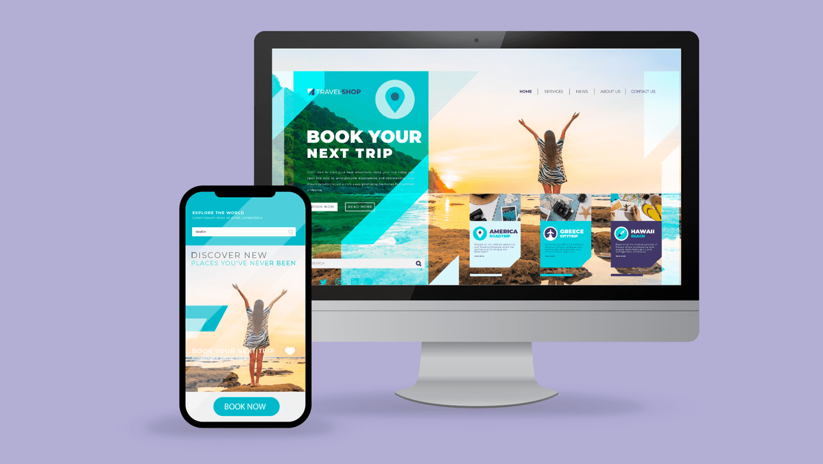
A professional marketing campaign needs a landing page.
Purpose of a landing page
The purpose of a landing page is very clear. Through various sources such as search engines, newsletters, social media, and advertisements, you want to generate as much traffic as possible to the specific landing page.Once they have landed on the landing page, it is important to prompt your customer to take action. This way, you can convince them of your product or service.
You must therefore determine in advance which action you have in mind. Here are some tips for strong Call-To-Actions.
Possible actions:
- Subscribe to your newsletter
- Fill out a form
- Claim a discount code
- Download your e-book
- Purchase certain products
- Read your new blog post
- ...

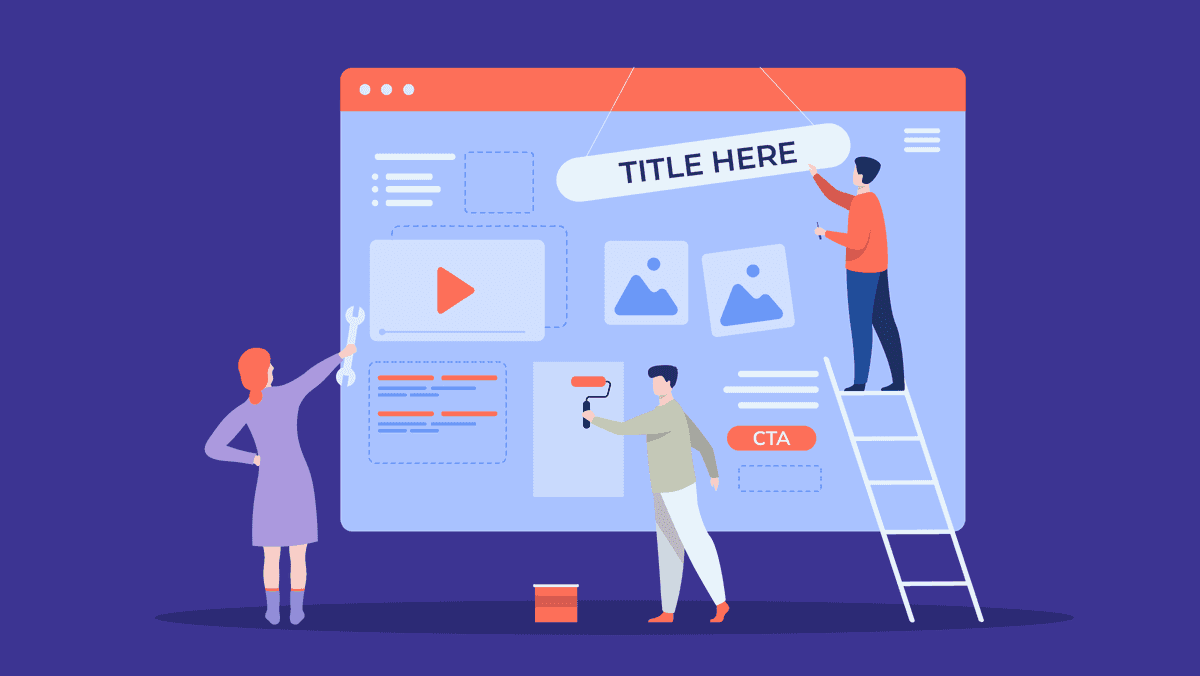
A good landing page saves you advertising costs.
Benefits of a landing page
Creating a landing page has several benefits, of course. For example:- Because a landing page matches your displayed advertisement, you can communicate directly with your target audience. Visitors will be less likely to drop off and will therefore absorb your message more quickly.
- It is a smart way to save on your advertising costs. If you advertise via Google, the search engine screens the relevance of your landing page. The more relevant, the better. As a result, your 'Cost Per Click' (CPC) will be lower, so you pay less per click.
- Not only do you increase your conversions, but you also make them much more targeted. You can focus much better on capturing a customer around a specific topic.
- Landing pages are a handy measuring tool. Conversion rates, open and bounce rates ... you can analyse it all accurately. These figures will help you to possibly adjust your marketing campaign(s).
- A good landing page works wonders for your email marketing. By putting your content on a landing page and linking to it from your mailing, you can measure clicks. This way, you learn much more about the interests of your target audience.
- Experiment with setting up landing pages by A/B testing. You use different versions of the landing page to test which version achieves the best conversion rate.
Different types of landing pages
Just as there are different types of web pages, there are also different types of landing pages. We have created this list for you:Click-through page
The most used landing page is the so-called click-through page. This type of landing page directs visitors to another page, such as a product or registration page. The click-through page should generate as many conversions as possible.Sales page
Selling products immediately is one of the reasons why a landing page is important. A sales page as a landing page is entirely focused on selling a product.The page contains nothing more than the product information, images, prices, and customer reviews. The customer can make a purchase directly through the sales page.
Product landing page
Your landing page can also be entirely dedicated to a product, without necessarily aiming to sell it immediately.On a product landing page, you can highlight a customer case or provide more information about the features and characteristics of the product. With a CTA that links to where you can buy the product.
Event page
As the name suggests, these landing pages are meant to attract participants for a specific event, such as a webinar, conference, product launch, or presentation.On the page, you provide all the details about the event, such as the date, location, speakers, agenda, and registration form.
Lead generation landing page
Lead generation landing pages are aimed at collecting leads by encouraging visitors to leave their contact information, such as their name, email address, phone number, etc.The action involves filling out a form where visitors can submit their information. In return, you can offer them an e-book or discount code as a thank you.
Long-form landing page
You might not expect it, but there are also landing pages with a lot of content. These are called long-form landing pages.You use this type of landing page partly to be found on Google (search engine optimisation), but also to introduce visitors to your brand or service.
By providing clear and concise information on the page, potential customers can delve into the subject matter you are discussing.
Long-form landing pages are also suitable for selling more expensive products. If you sell products in a higher price segment, the visitors of the landing page need more persuasion and trust. You achieve this by highlighting the unique features or all the benefits of the product.
These elements should not be missing
Creating your own landing page? Then you need to consider some important elements. Each one is a factor that makes a landing page successful.Sidenote: not every landing page needs to be filled with all elements. Everything depends on your goal and the action you have in mind. 😉
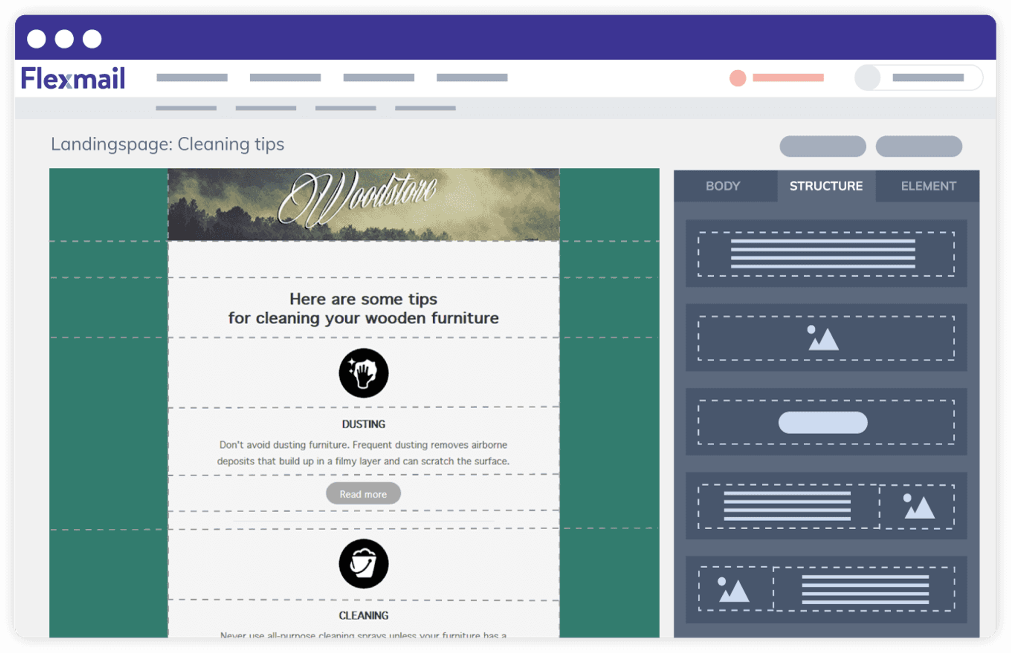
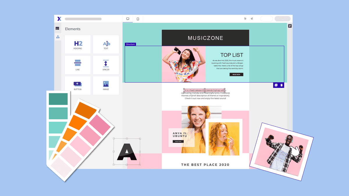
Various elements contribute to the perfect landing page.
A striking title
A good landing page must stand out. So come up with a title (headline) that grabs the visitor's attention.Arouse their interest to read further. Does your service make your customer's life easier? Is there a unique promotion going on? Try to incorporate these attention-grabbers into the title.
A professional layout
Landing pages with an attractive layout generally perform better. They reinforce your core message. If possible, add relevant photos and videos to your landing page.A convincing Call-To-Action
A good landing page almost always features a clear and convincing Call-To-Action. Place the CTA prominently on your page and create a noticeable action button.Clear content
It is important that readers can easily scan the content. Therefore, use bullet points, subtitles, and short paragraphs. The content itself should be clear, concise, and to the point.Customer testimonials
Social proof such as customer reviews, cases, and testimonials, demonstrable figures ... increase the trust of new customers.If they see that other customers have gone before them and are satisfied, they will be more likely to take the desired action. Positive feedback is valuable content that increases the credibility of your page.
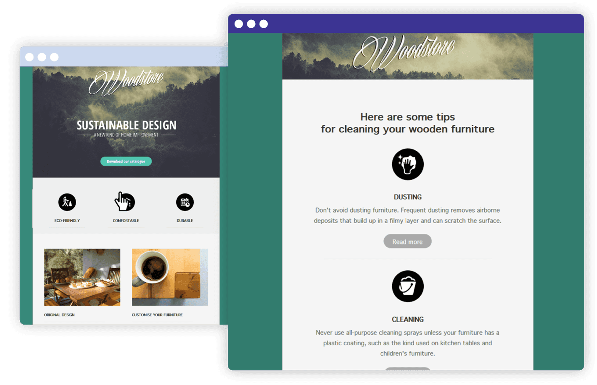
A mobile-friendly landing page convinces visitors to take action.
Responsive design
There's a good chance that visitors will land on your page via a mobile device. Therefore, your landing page must be responsive, so it adapts to any screen. Mobile-friendliness is very important nowadays.Optimising landing pages
Landing pages that incorporate the above elements will perform well! Trust us. 🙂 But that doesn’t mean there aren’t tricks to optimise your landing pages. By making some adjustments here and there, you might attract even more traffic.Conducting A/B tests is the best example of this. Create different versions of your landing page and compare the results. You can experiment with various components of your page such as title, text, images, colors, and CTAs.
Anyone intrigued by your ad who clicks open your landing page should quickly see content. The slower your website, the higher your bounce rate (visitors who leave immediately after clicking). Load speed is crucial. With these tips from Combell, you can make your website faster.
Optimising also means keeping a pulse on your performance by using analytics tools like Google Analytics. This helps you spot weak points and find ways to improve them.
Beware of these common mistakes
For completeness, we’ll also mention common mistakes that arise with landing pages. It would be a shame not to make the most of your pages. So, watch out for these errors.- Too much distraction: never clutter your landing page with unnecessary images, pop-ups, links, and buttons. They can distract your visitor from what really matters and hinder conversion. If potential customers get confused or overwhelmed, they will leave your page faster.
- Too much information: an overload of information can confuse visitors, and before you know it, they are lost. Too much text or complicated content leads to information overload and a higher bounce rate.
- Unprofessional design: a poorly designed landing page can detract from the credibility and professionalism of your brand, making visitors more likely to click away. You mustn't let this happen!
What is a landing page? Now you're fully informed!
So. 🙂 After reading this blog, landing pages should hold no more secrets for you. Or does all the information need to sink in (😅) for a moment?Either way: did you know that with Flexmail you can design landing pages that are perfect for email marketing?
 Jasper Van Biesen