Unfortunately, many B2B emails in your inbox are not a model of creativity and personality. Perhaps you think that you can only use funny or playful promotions in B2C to sell products and services. As a B2B marketeer, however, you communicate with people in the first place.
In this article, we show you various types of emails that should be part of your stock. We share examples and show you which elements give these emails their strength.
In this article, we show you various types of emails that should be part of your stock. We share examples and show you which elements give these emails their strength.
B2B email examples:
Start with a strategy
Email marketing is mainly successful when it is based on a plan. To make sure your recipients open your emails and click your call to action, you need to do the following:- Define clear aims: what would you like to achieve with this email? What do you want people to do?
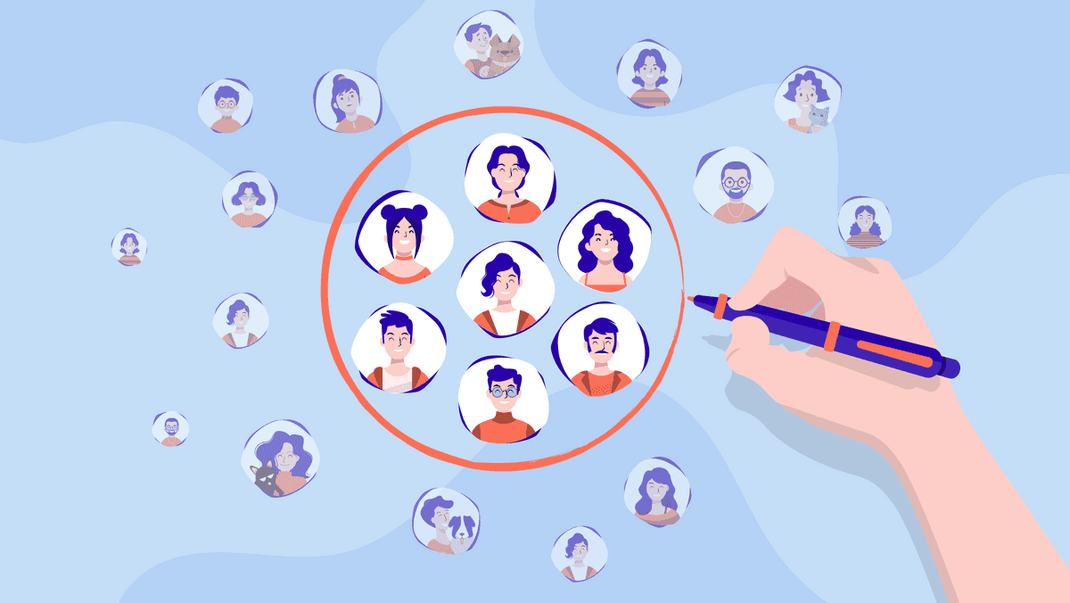
- Choose your target group: to whom is your email directed? What is interesting to these people?
- Make a plan: how often will you be communicating? How will you measure the result?
B2B email examples
A list of the most effective types of emails you can use for your business is provided below.Found something that looks suitable? Then remember following:
- The design
- Content structure
- Message and how you communicate this message
- Is personalisation used? Via tags or in the choice of a target group? What is this target group?
- Does your communication include a clear call to action? Is it clear what the sender expects from the reader?
- What language is used? Is the style informal? Is the contact addressed directly?
- Are features or benefits mentioned?
1. The welcome email
Welcome emails are not just effective for B2C use and do not always have to include a discount. You always say ‘welcome��’ or ‘good morning’ when a new customer enters your company.Your welcome mail is the very first time a new subscriber has contact with you. These mails also generate the highest open ratios of all the emails you will send them. So, say ‘hello’ and start with the right expectations right away.
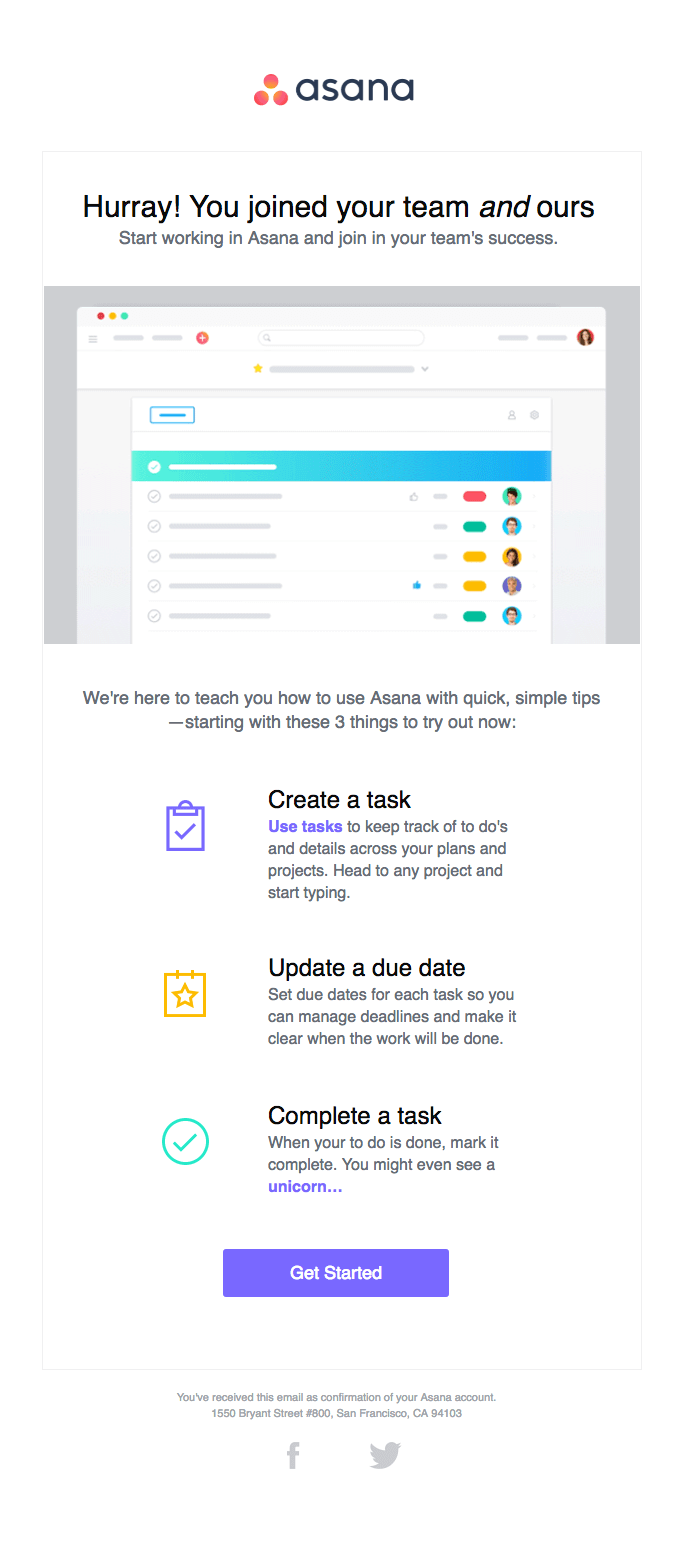
Below is an example of Asana, which introduces its platform to new subscribers.
What is good about it?
- Short and sweet
- Gives the reader a good feeling
- Clear call to action
- Asana’s strengths explained
- Starts the relationship by saying that will share brief tips to make your start a success.
Other tips:
- Try to offer various options, so that you get an initial impression of what is interesting to the contact. You can use this information in your subsequent emails.
In online software tools, welcome emails have taken hold. Yet, they appear too little with other B2B companies. If you implement one mail from this list, make it the welcome mail.
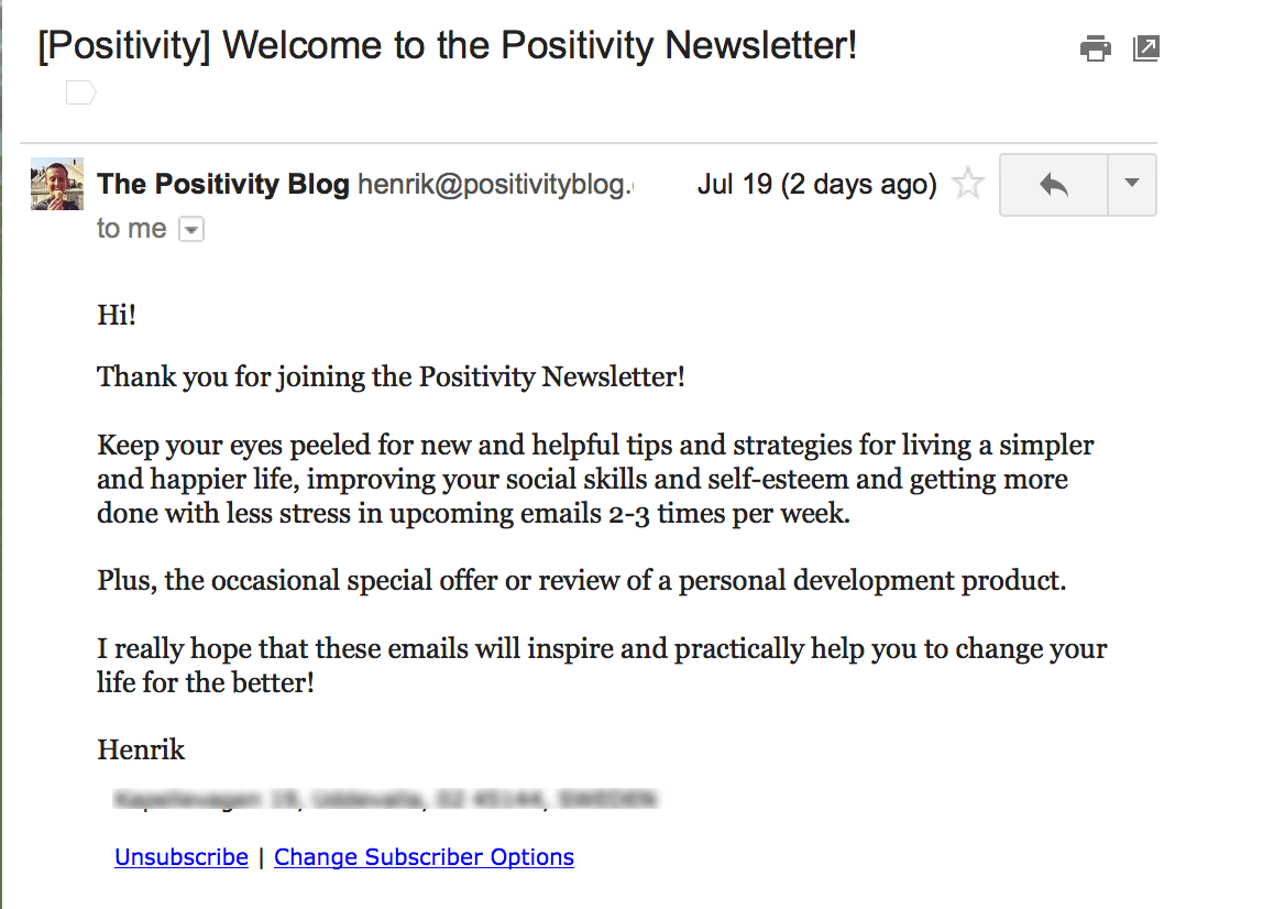
An example from the other side of the spectrum is provided below:
This welcome mail has almost no layout, to give you the impression that you have just received an email from a contact. The professionalism and expertise conveyed by an orderly design must therefore be shown in a different way.
What is good about it?
- Clearly indicates what the reader can expect in the future (and how often).
- Indicates that you are grateful for the new subscription.
Other tips:
- If you opt for the ‘text email’ approach, go all the way. Starting every word with a capital gives a ‘marketing email’ impression.
- If you promised a download or e-book or something similar with the subscription, place the download link in your welcome mail right away. That's what they've come for.
2. The update email / newsletter
Unlike a content email with tips (see number 3), an update email is where you discuss what's new or where you provide other information that could be relevant to your reader. Think of options that may disappear for your customer, price adjustments, news about amended legislation, items that are suddenly out of stock, delivery delays, your opening hours, or other important information.You can use two different approaches:
- 1 update per email
- Combining updates in a newsletter.
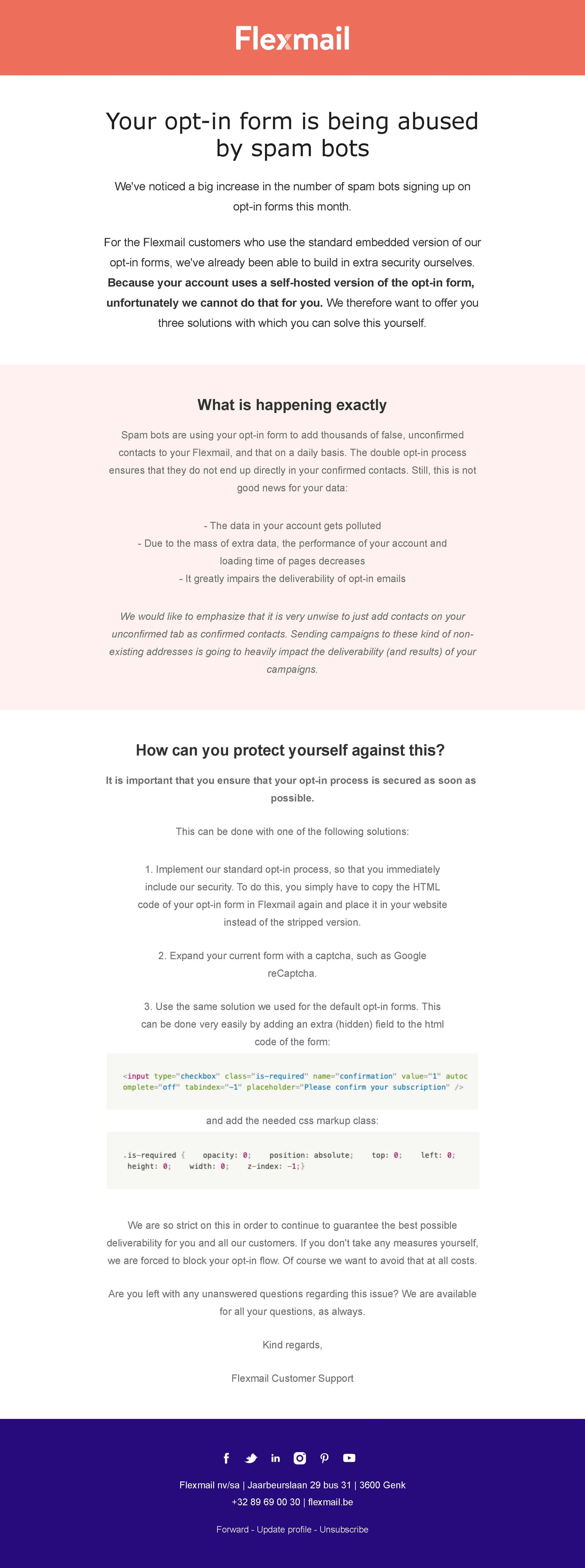
Look at the Flexmail example below:
We believe that our customers should be informed in a timely manner about any issues or important information about their account. This email was only sent to customers who we knew were dealing with this issue.
What is good about it?
- Clearly indicates what the issue is.
- Provides instructions about the steps they need to take.
- Visual elements that guide the eye.
Other tips:
- Choose your target group carefully.
- Think carefully about any additional questions your target group may have and try to ensure you have an immediate response to these.
- By using words in bold type, you can emphasise what is important.
In the example below, Unizo clearly opts for grouping multiple pieces of information into a single email:
This has the advantage that your authority is unmistakable and that your readers will probably find what they are looking for.
What is good about it?
- Clear buttons
- With text that invites readers to click the buttons
- Visual distinction between the various areas
- The chairman’s opinion piece at the top has the ring of authority to it and is always well read.
Other tips:
- With such newsletters, you must remember that your content pieces compete with each other. Particularly the final lines are only discovered by people who scroll. Make sure the content you offer is always worthwhile and think about ways to sell your content visually.
- It can also be interesting if subjects are referred to in multiple newsletters. Look at this example: ‘Don't forget the deadline for telework registration.’ By repeating an important subject in a shorter text, you bring it to the readers’ attention again. You can add a link to the original information on your website.
3. The tips & tricks email
Unlike an update email, with tips & tricks emails, you share content that is specifically focused on providing your readers with tips. These can be directed to the end customer, but they can also be very interesting for training sellers or resellers and for helping you sell your products or services better. For example, they can be used to make contractors sell new paint colours by informing them about seasonal trends.Here is an example from Whirlpool:
What is good about it?
- Clear visual distinction between the various articles
- At the top of the newsletters, it says that all the articles are about washing machines and that they help you make a choice, hoping you will scroll further.
Other tips:
- Here, you often see the ‘read more’ text link. Sell your articles better by writing more attractive text explaining exactly what the next page is about, regardless of whether you share only one tip or multiple tips in a newsletter.
- A large image at the top of your email and in line with your message is attractive. But remember that this will push your other content further down. This means that your readers will have to scroll to see the first tip. Consequently, your subject line will become more important to show the value immediately.
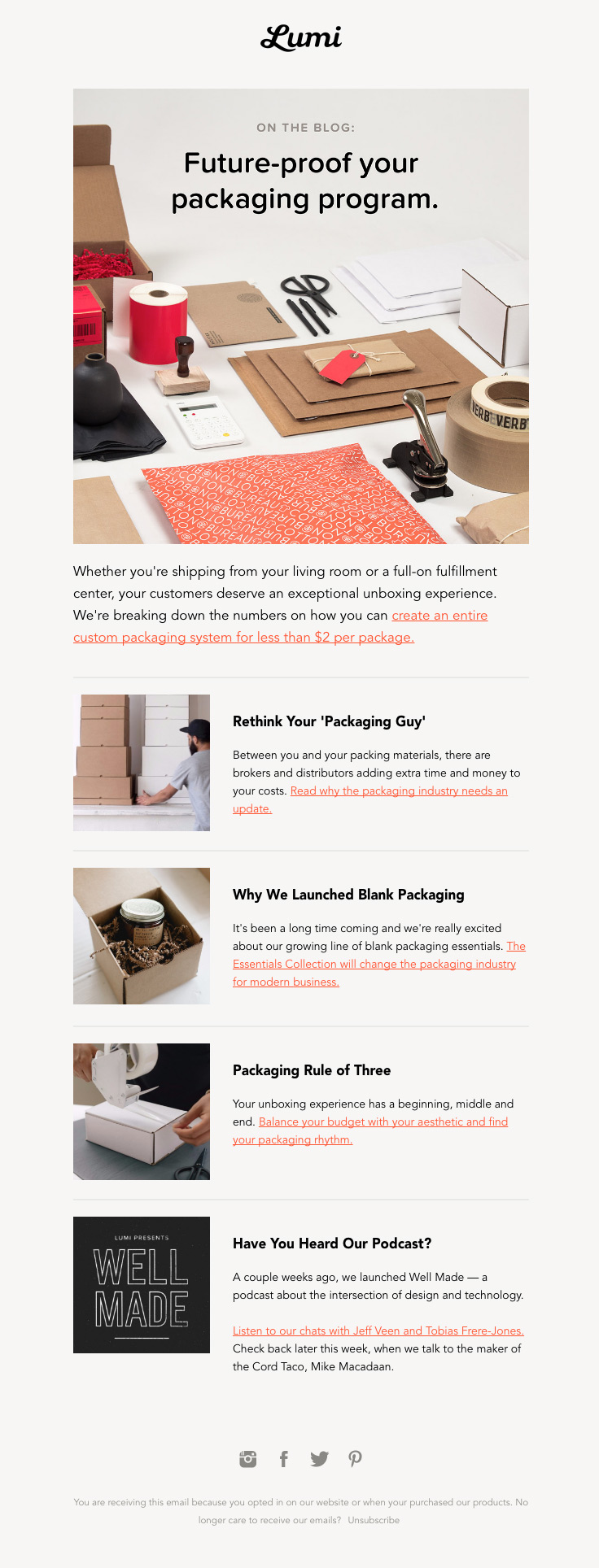
A slightly different variant is shown in this Lumi example:
What is good about it?
- Due to the use of colour and the rounder typeface, this email is lighter in tone than the previous one.
- There is still a clear distinction between the articles, in this case by means of lines.
- No calls to action but text links. It comes across as ‘newsworthy’ rather than ‘sensational’. The readers also know what they will get if they click them.
Other tips:
- Unlike the Whirlpool example, this is about one topic (packing), but more various content is combined. It may be a good idea to work with small subtitles, such as ‘white paper’, ‘blog’, and ‘podcast’, to make a bigger difference.
- If you place text links in the paragraph, make sure that the links are not too close together. Otherwise, mobile readers might accidentally click the wrong link while navigating.
4. The announcement
Have you launched a new option? Are you offering a limited edition? Can people pre-order? Share it with your target group!When announcing a new product, service or option, you want to pay some extra attention to it. Always start with the question: why would my reader consider this interesting? The answer reveals more about your approach and the proper target group.
An announcement creates anticipation and craving, and your readers get involved in your company as a result.
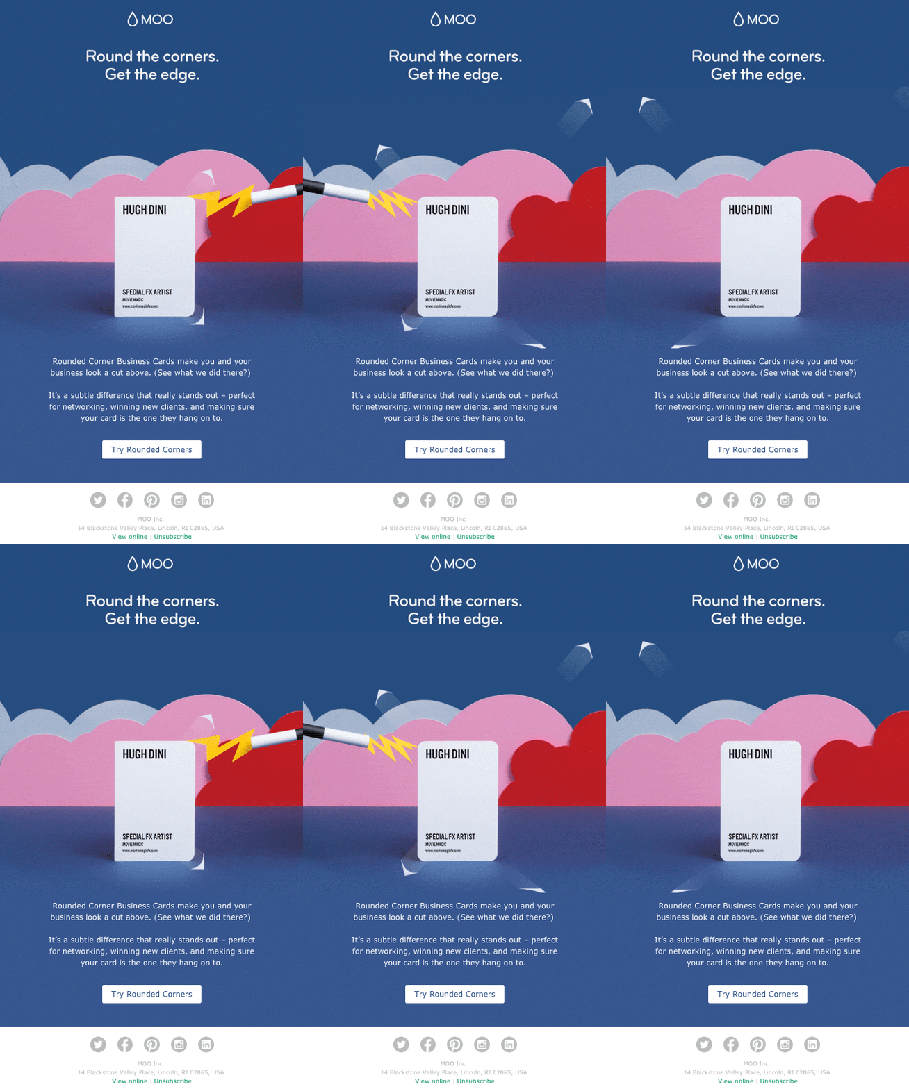
Let’s start with this printing shop example:
At Moo, you now have the option of getting visiting cards with rounded corners. Moo uses the inverted pyramid-method: short copy, centred on the page, which should guide the eye to the call to action at the bottom.
What is good about it?
- Inverted pyramid method to catch the attention
- Short, attractive copy
- Content explaining why this new option could be interesting to you
- Animated GIF to draw your attention
- Clear, engaging copy for the call to action.
Other tips:
- What if the style does not fit in with your business? Another good option would be to insert this visiting card in a stack with straight corners, showing that it really stands out. In this way, you make the copy of the final page stronger.
- To further emphasise the message, they have also rounded the corners of the call to action. A really fun detail. Don’t forget that this is not supported by Outlook. The button corners will remain straight.
- Think carefully about the first frame of your animated GIF for email clients that do not support the animation.
Invision launched an entirely new product and used a different approach:
What is good about it?
- Content divided into four sections to highlight the possibilities.
- Each section has its own call to action and landing page.
- Clear, engaging link text.
- Ending on a strong note with a clear call to action to try Freehand.
- A clear focus on the advantages to the reader, in both the title and the various parts.
Other tips:
- Although this email is about your product, always put your reader in the spotlight, also as the subject of your text. The word ‘we’ only appears twice in the entire email.
- Because the email is long, the call to action is placed at the top and at the bottom.

Free Email Marketing Masterclass
Discover in 5 modules how to set-up email campaigns that hit the mark every time.
Start today5. The invitation to the event or webinar
Normally, events generate most leads in B2B marketing. If you attend a live event, let your readers know! Webinars are a perfect alternative for sharing interesting insights and tips with your audience.Email marketing is indispensable for both types and at various moments:
Before
Within a short period of time, the reader receives a lot of information. This can have an overwhelming effect. Focus specifically on the added value, on what exactly is going to happen, who the speakers are, and on other practical details that could be interesting (like the date, for example).Look at this example by Zoom for their webinar:
What is good about it?
- Short copy and a clear call to action
- If I don't find the first webinar interesting, there may be other webinars I would like to participate in.
Other tips:
- Is it clear what I will be learning in this webinar? In other words, do I have sufficient information to be convinced I need to register?
- Is the call to action ‘Get on the wait list’ sufficiently clear? What is this wait list? Is my registration uncertain then?
- Make sure that all emails about your event clearly include your branding and possibly event-specific branding.
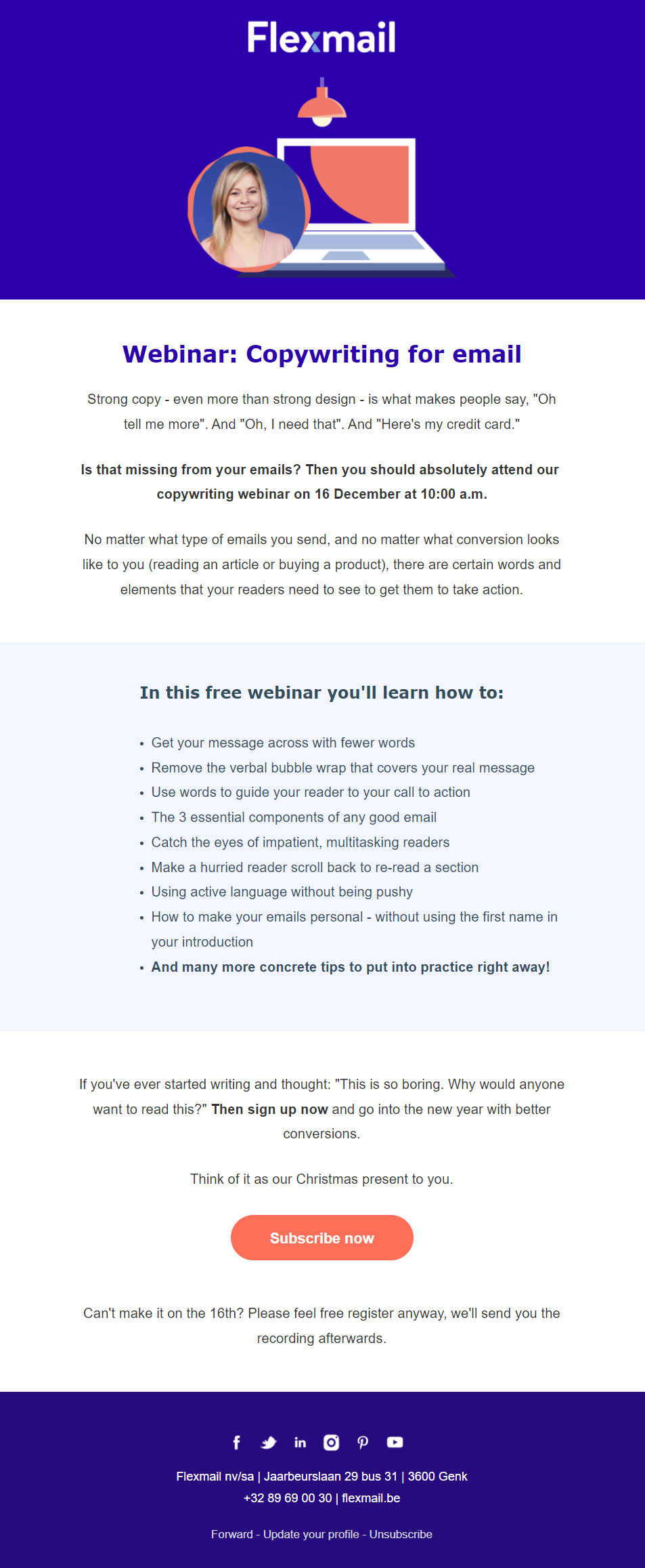
When Flexmail prepares a webinar, we use this template:
What is good about it?
- Bold type used for important information.
- Bullet points catch the reader’s eye, so never place a list in the form of a normal paragraph.
- Is it possible to receive a recording? If so, put it in the mail (preferably close to the button for extra persuasiveness).
Other tips:
- Readers who are already persuaded to register after reading the introduction should see a call to action after the white block.
- If you also use a large image at the top of the email, make sure it includes interesting information (such as the title and date).
What communication do you need for your event?
If you opt for a physical event with various speakers, and if you want to sell tickets, it might be a good idea to use reminders in which you can put various speakers in the spotlight. Subject lines like: ‘X reasons why XYZ is an event you cannot afford to miss’ stand out.Also consider using a reminder for your webinar.
Practical details with parking facilities and reminders to registered participants are also very useful. Your content has added value and a high degree of extra service.
After
After the event too, there are things you need to communicate. Perhaps not everybody was able to participate. It is up to you to be their eyes and ears and summarise interesting information. Here, your position as an expert comes into its own.Also consider sharing a replay, so that your readers can find the information themselves.
To show you really care about the participants, you can use a survey to ask them about their experience. This will also give you information you need to do things better next time. You can also use positive reactions to promote the next few editions.
6. The survey email
If you want to do well as a company, you must emphasise that your customers’ feedback is important to you. A survey is a good method to do this.But how do you make sure that people complete the questionnaire? Who enjoys completing questionnaires? Your biggest fans and people with frustrations or concerns. The average customer or reader needs some more persuasion.
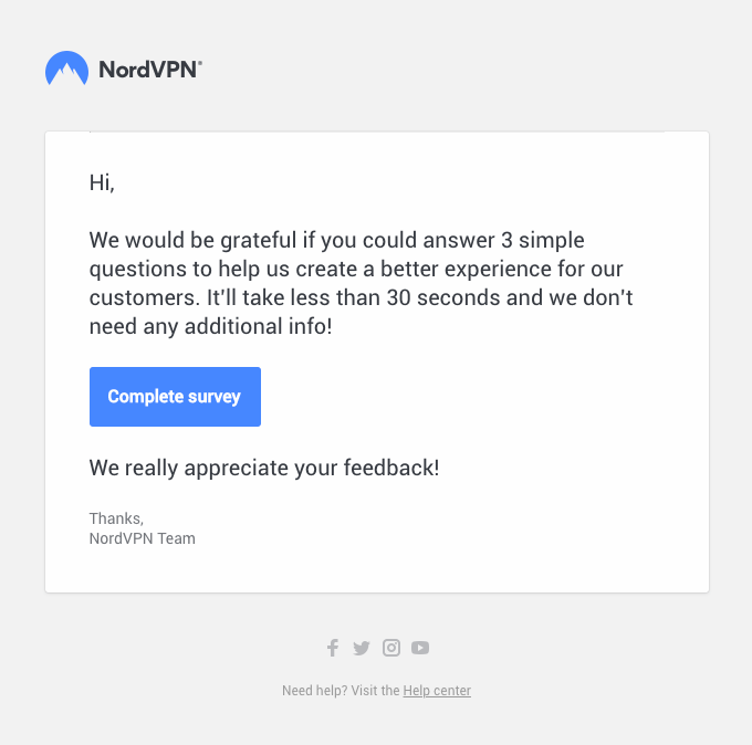
Here are some examples in which various tricks are used:
What is good about it?
- They clearly indicate only three simple questions should be answered.
- This means it will not take long.
Other tips:
- The fact that you want to provide a better experience is interesting. But could you be more specific? What is in it for this customer?
hers shares the survey results with the participants, a nice incentive to get them to complete the questionnaire:
What is good about it?
- The results are presented in a conveniently arranged manner.
Other tips:
- Make sure that the text of your presentation is not included in the image too. Be critical about how your email will come across if the image is not displayed as standard. This particularly applies to B2B.
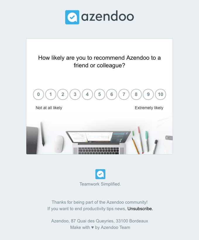
azendoo uses a smart psychological trick:
The Zeigarnik effect is clearly discernible in the example above. People are inclined to finish what they have started.
Here, a minimum effort is requested: what score do you give? After you have clicked, you can present some further questions. The reader has answered the first question, so they will also answer the rest. If they don't, you have still been able to save their answer to the first question.
What is good about it?
- Smart use of the Zeigarnik effect.
Other tips:
- Why do the readers receive this survey? Because I've been a customer for a week, or already have some experience with you? Remind me of our relationship.
- This is one of Cialdini’s ‘principles of persuasion’: reciprocity. I've scratched your back, so could you scratch mine?
7. White paper and guide email
White papers are long pieces of content to promote your expertise and insights. They position you as an authority in your sector and as the ideal partner to work with.So, do you want to share insights on trends in your industry, new legislation, or solutions? Combine them and put them to good use! You can share them with your target group and recycle them later as a lead magnet with your opt-in forms. A great way to get new subscribers!
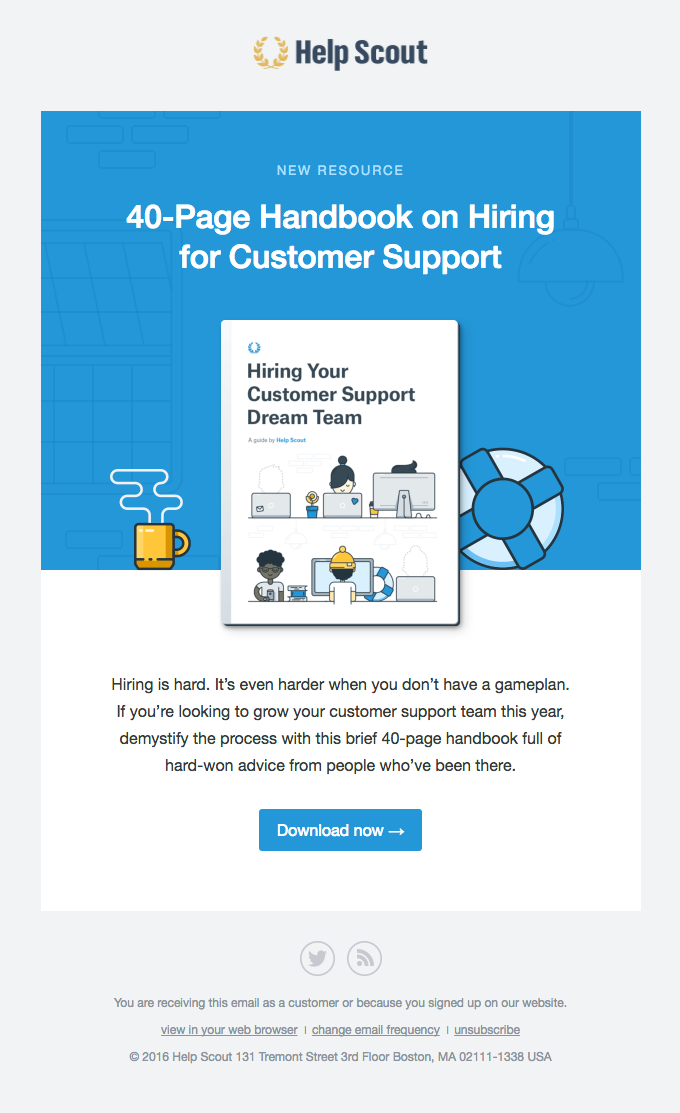
Like in this Helpscout example:
What is good about it?
- Helpscout always uses the inverted pyramid method in its emails. Every element guides the eye to the call to action.
- Clear copy on the button.
- The image does not push the title too far down.
Other tips:
- In only two sentences, Helpscout can sketch a clear situation for the target group of this e-book. Good texts are not long but can touch the reader at the right spot.
8. The case email
Are you very proud of a recent cooperation with a customer? In a case, you can write about yourself in a way that is also useful to your reader. You show your expertise and inspire your reader. Besides, you have the benefit of social proof: your satisfied customers will spread the word about their cooperation with you. This is more effective than any promotion you could do yourself.In this example, Metalab presents a case as part of its newsletter. They can show off with a big name like Headspace, which makes people curious. To a large extent, however, the copy is still about Metalab. Furthermore, the case needs to compete with other articles in the newsletter.
What is good about it?
- Big titles and concise paragraphs
- Clear calls to action
Other tips:
- You get more readers interested in your case by making them curious when they read your article. In this example, Metalab does this by sharing the best results for Headspace. You can also seize the opportunity of giving them a tip.
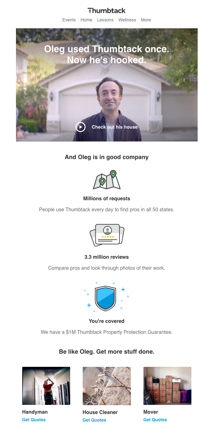
Thumbtack has a clear focus in the following email:
What is good about it?
- A photo of the customer included
- The Play button clearly indicates it is about a video
Other tips:
- There is no separate call to action. If no images are shown, the reader cannot click through to your case. Especially in B2B, you need to take this into account.
- The other elements in the mail indicate that Thumbtack uses this as a sales email. The major sales arguments are provided below the case.
9. Last chance email
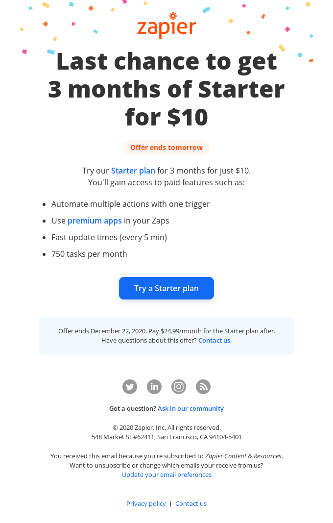
‘Last chance’ or ‘FOMO’ emails are an ideal way to repeat an important message in a credible way, and give hesitating contacts the final push to purchase.These emails come in different variants:
- ‘This deal will expire in three hours.’ The most common and least subtle variant. Your deal is central, and there is the warning that you will definitely miss out on the opportunity if you do not respond now. This approach is very effective for impulse purchases.
- ‘Other customers are interested in XYZ.’ This type of message works in 2 ways. You provide social proof. You also show that products are in great demand and might sell out soon. Websites like booking.com use this type of trick excessively.
- ‘X is temporarily sold out.’ This is a reference to the consequences of not reacting quickly. You will have to be faster next time.
What is good about it?
- The exact deal as well as the deadline are immediately visible.
- A summary of the extras you would get.
Other tips:
- This type of email includes a repetition. It should be sent specifically to a target group where the chance they will accept your offer is highest. After all, you don't want to cause any frustration (or you want to minimise it as much as you can).
10. The anniversary email
Perhaps you think a birthday email can only be used in B2C. You may be right: it feels strange or rather obtrusive to ask someone’s date of birth in B2B. Many anniversaries in B2B, however, are a good reason to consider: the commencement date of your customer relationship, for example. Some original applications are provided below.For charities, you primarily depend on contributors. When you have received donations, you want to involve these people in your project. They want to know if their donation has really gone to the right place. Care Australia does it like this:
What is good about it?
- Care celebrates the first anniversary of their project.
- All highlights of that year are presented clearly, with images to unlock emotions.
- Strong end with a call to action to other projects.
Other tips:
- If you want to raise funds, this is the perfect way to show impact and social proof. You put the spotlight on your charity again, you generate support among people you know are willing to donate and participate in a project again.
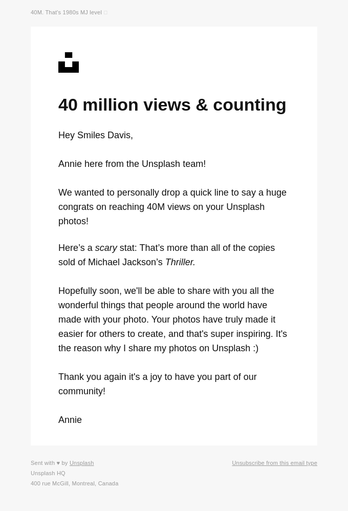
Unsplash doesn't work on a specific date but on another personal milestone, the number of views of your images:
What is good about it?
- No flashy designs or promotions.
- The copy and the layout come across as very personal; it is YOU they want to celebrate.
Other tips:
- This type of communication works even better when it clearly deviates from your usual style. And you are obviously announcing something nice: a major milestone. This is not a simple ‘letter’ to share your company’s anniversary without being of any use to your reader. So always ask yourself: what is the added value for my reader to receive this?
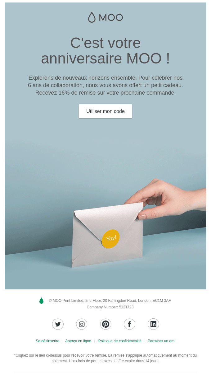
Here is another example of printing shop Moo:
What is good about it?
- The title is above the image and is visible immediately.
- Short text, which guides the eye to the call to action.
Other tips:
- From a visual perspective, the promotion can be shown even more clearly: by using bold type in the copy, and by showing the promotion in the image too.
- In the call to action, a promotion code is suddenly mentioned, which is not referred to anywhere else. Will it be applied automatically? Don't leave any important questions unanswered.
Achieve your goals with a personal approach
The next time you find a B2C email in your inbox, don't think you can't learn anything from it. Like every other business, you communicate with people. When you come across a strong email, ask yourself these questions:- What is the target group here? Why am I receiving this email?
- Is the purpose of this email clear right from the start?
- Do the various elements work toward conversion?
- Is the copy written in the active voice? Is it about features or benefits?
Don't forget that something strange happens to most B2B marketeers when they sit down at their desk. They stop functioning like a normal human being and go into business mode. Their business alter ego is rational and business-like. In itself, there's nothing wrong with that.
Most B2B emails fail in an essential respect, though: making their target group enthusiastic about what they have to say. Also focus on the emotional, human aspect of what you want to convey. This is the only way in which you can build a relationship with your target group.
Would you like to try Flexmail?
Design mails tailored to your needs, reach your target group, and learn from the proper results.
Get a free trial now Michelle Dassen