Take it from us: there’s a high chance your subscribers are opening your emails and newsletters on a small screen, like a smartphone. To stand out in crowded inboxes, your email marketing must be fully optimised for mobile. This article will guide you.
Emails not mobile-friendly? Delete!
That’s exactly what more than 42% of users do when they receive emails that are hard to read on their phones.That’s no small number, especially considering that 42% of users access their inboxes on mobile devices. Adding to that, there are an estimated 4.15 billion email users worldwide—a number that’s only expected to grow.
Email and smartphone usage go hand in hand. Speaking of hands, reading an email on a handheld mobile device is vastly different from viewing it on a computer. This is exactly why you need a responsive email design.
While tools like our super-handy Email Builder can help you make your emails mobile-friendly, it’s not a one-click solution. There are many popular email apps such as Outlook, Gmail, Yahoo, and Apple Mail. Subscribers can choose the app they prefer to read emails, which is convenient for them but challenging for senders because each app displays emails differently.
Start with the basics
Once you decide to work on a responsive email design, we can imagine you might not know where to begin. Before we start showering you with tips, we want to share the most important basic principles.- Provide dynamic layouts and breakpointsAre you coding your HTML yourself? Ensure that the content can dynamically adjust to different screen sizes. Use breakpoints to display specific elements differently based on screen size. This allows you to automatically switch from a two-column layout to a single-column layout when the screen width is too narrow.
- Drag & drop builder: create emails without technical knowledgeWith our intuitive drag & drop builder, you can create beautiful, responsive emails in no time – without needing to know a single line of code. Drag elements to your desired position, adjust colors and text, and watch your design come to life instantly. Our smart builder automatically generates the perfect HTML code in the background, so you can focus entirely on what really matters: your message and design.
Use Flexmail’s builder - Work with a single-column layout
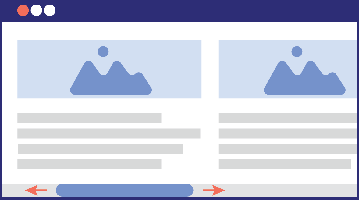 Important: Design your emails with a single-column structure to prevent the content from being too wide and requiring your readers to scroll horizontally—definitely a bad idea!
 - Make navigation touch-friendly
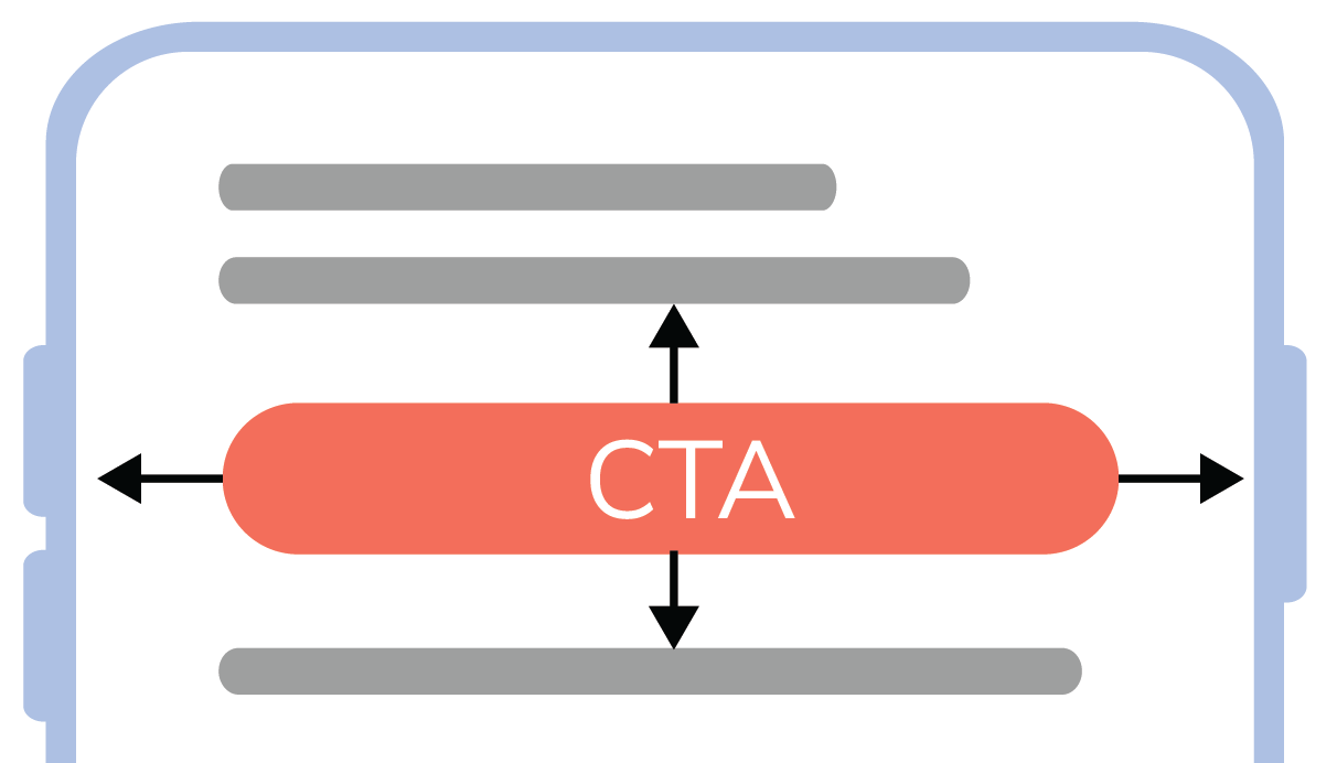 Your emails aim to encourage customers to take action. For this, you need action buttons or Calls-to-Action (CTAs). Design buttons and links that are large enough to be easily selected with a single fingertip. Also, ensure there is sufficient spacing between clickable elements to prevent errors caused by accidental touches.
 - Optimise CTAsNever forget to optimise your CTAs. Ensure your CTA buttons are at least 44x44 px in size, and if possible, position them above the fold for immediate visibility. Use contrasting colors to make them stand out.
- Capturing the essentials above the foldWhat is "the fold"? The "fold" in an email is the point where the email’s content is cut off, and the reader must start scrolling to see more, similar to a newspaper page. The fold is typically around the top 600 pixels of the email display, depending on the user’s screen size.
- Provide stackable content blocks
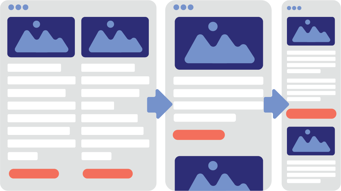 Ensure that content blocks are automatically stacked vertically when the screen size decreases. This improves your email's readability and keeps its structure organised.
 - Adjust fontsAdapt the typography for smaller screens. Use a font size of at least 14-16 px and ensure sufficient line spacing (1.2-1.5x the font size). To enhance readability, keep your paragraphs short as well.
- Use responsive images and media
 Ensure that images are responsive and scale automatically. If you use GIFs, limit their size to optimise loading times. Don’t forget to add alt text to your images, which is beneficial for the user experience.
 - Test your mobile designsThe only way to ensure your mobile designs work is to test them (send test emails to yourself and open them on your phone). Check for overlapping text or incorrectly scaled images. You can perform mobile previews on various devices. This helps avoid common errors. When designing for mobile, always start with templates for the smallest screen sizes. In Flexmail, you can easily test emails and check their appearance.
Designing mobile-friendly emails? Flexmail has tips for you
In this blog, we share essential tips and techniques to ensure your emails are not only opened but also effectively read and understood on any screen size. 😊Mobile readers like it fast....
Emails that load in the blink of an eye—your subscribers wouldn’t want it any other way! Fast loading times are crucial, both for websites and newsletters.Speed up load times by optimising your images and code. How? Use compressed image formats and minimise the amount of HTML and CSS in your emails. Also, opt for standard fonts—since these fonts don’t need to be loaded externally, they don’t consume any data.
Users with limited data plans will thank you. These optimisations significantly increase the likelihood that your subscribers will open and read your emails.
... and simple
Since we’re all super busy, we don’t want to waste too much time on emails. Mobile-friendly emails need a simple structure. As users scan your content, you should include touchable elements and give your content a clear hierarchy.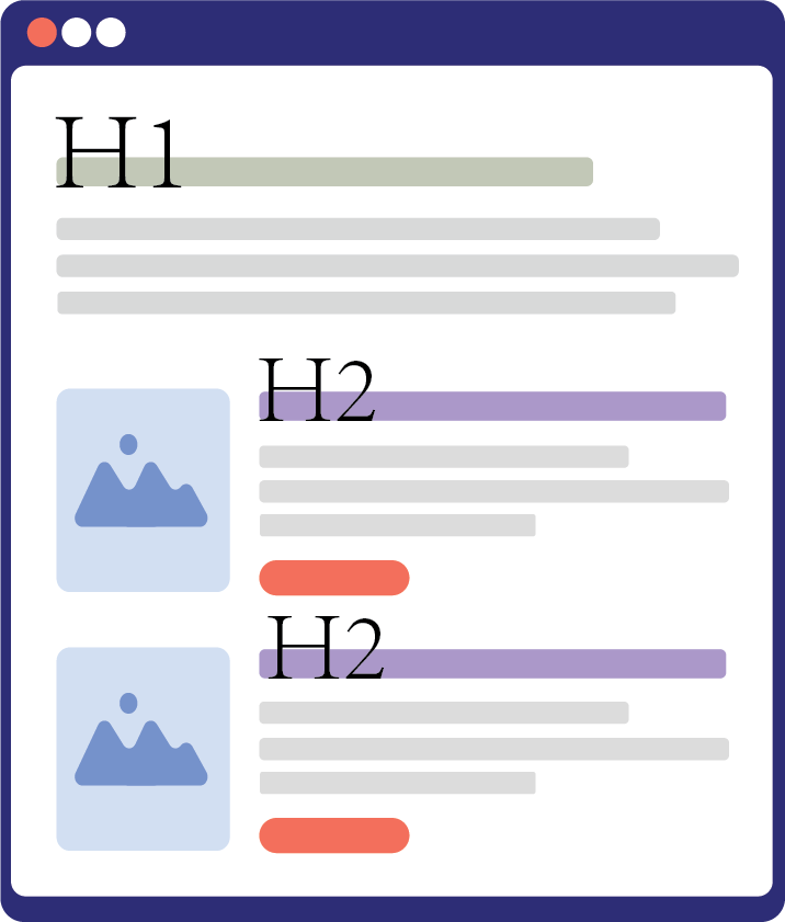
Text readability is also important; use a font size of at least 14px for body text and ensure sufficient contrast between the text and background. You don’t want to strain your readers' eyes.
To make the email scannable, use short paragraphs and clear headings and subheadings, so your readers can quickly find key information. Users also appreciate CTAs that are easy to see and touch. The easier, the quicker you’ll get a click.
To make the email scannable, use short paragraphs and clear headings and subheadings, so your readers can quickly find key information. Users also appreciate CTAs that are easy to see and touch. The easier, the quicker you’ll get a click.
Turn your desktop version into a mobile-first design
Happy with how your email looks on desktop? With a few crucial adjustments, you can transform it into a mobile-friendly design. Our drag & drop builder makes this process simple – you just need to rearrange elements and the tool automatically handles the technical adjustments.Adjust the layout by modifying the column structure. While a desktop design often consists of multiple columns, it's essential for mobile to switch to a single column structure.
In the drag & drop builder, you simply drag elements into a logical order, with the most important information right at the top. This way, users don't need to scroll horizontally and your message remains clear.
Don't forget to scale images. Use responsive images that automatically adapt to different screen sizes and add alt text to make the content clear when images don't load. The builder automatically optimizes your images for every screen, ensuring your message gets across even to subscribers with slower connections.
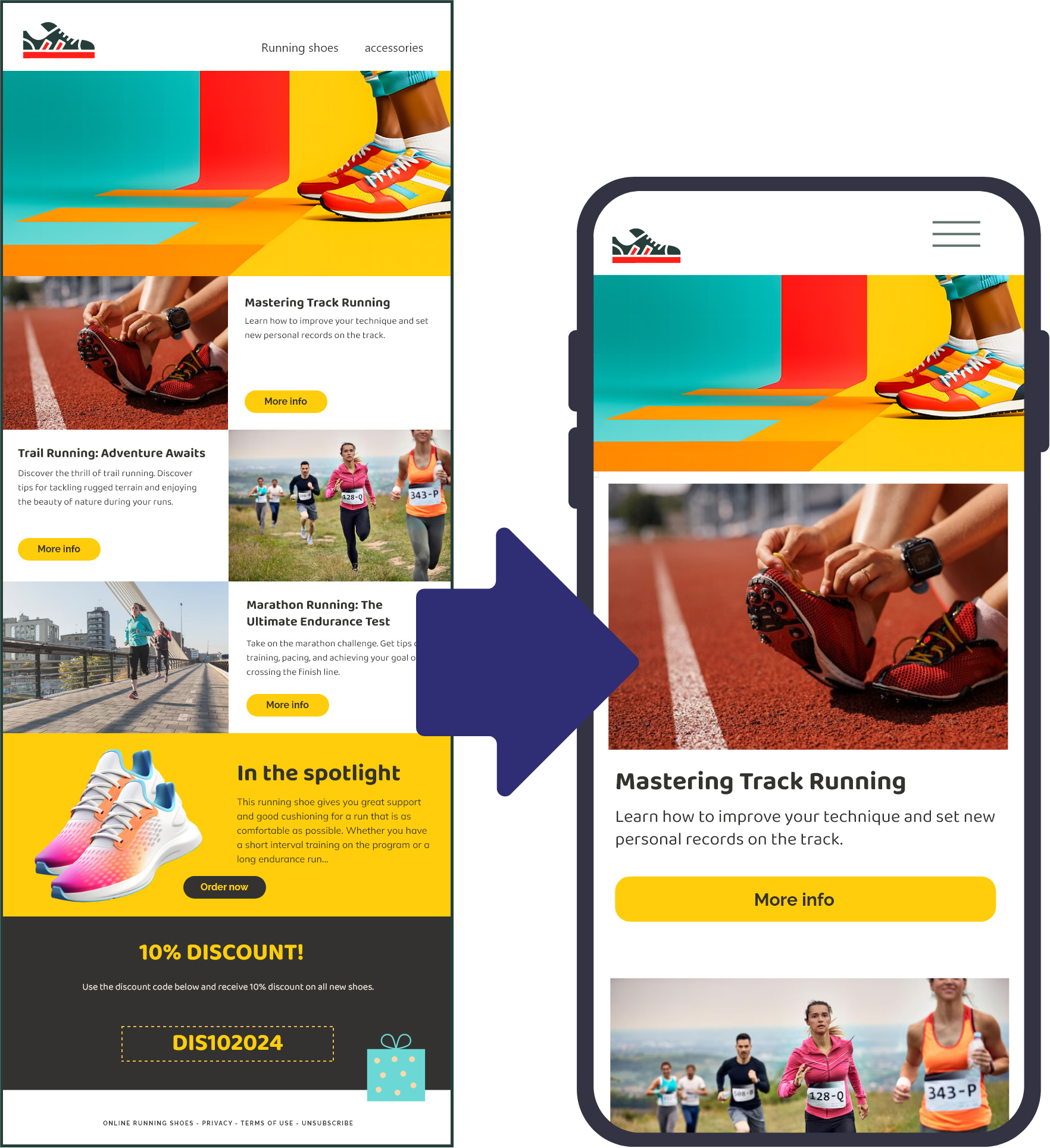
Finally, tackle the CTAs from your desktop design. With the drag & drop builder, you can effortlessly adjust buttons: make them full-width to facilitate tapping and ensure sufficient white space around the CTAs, so your subscribers don't click the wrong thing.
Optimise your headers
To make a professional impression and clearly indicate who the email is from, you need subtle yet recognisable branding in your header. Adjusting the preheader text is crucial, as this is the first line of text visible in a mobile inbox. Keep it short and intriguing, so readers will want to open your email right away.Focus on your core message
When designing mobile emails, it’s essential to focus on the core message and your primary CTA, the most important button.Mobile screens have less space, so you need to adapt your content. Only this way can you convey the essence effectively. Start by identifying what is necessary to deliver your core message. Think about the most important information and which elements (images, headers, etc.) are needed in your email. Leave out anything that distracts or is unnecessary, so your reader can immediately focus on the essence of your email.
Check if the images you have ready are truly needed. If yes, optimise the file sizes to reduce load times without compromising on quality. Avoid complex, multi-column layouts, and make sure links and CTAs are designed so that users can easily tap on them without accidentally clicking on another block.
To make your message truly "in the picture", you’ll need a legible font size of 14-16px and increase the line spacing to about 1.5 times the font size. Whitespace is also key here: use clear whitespace between paragraphs to keep the content neat and digestible.
Don't forget about dark mode
More and more people are reading their emails in dark mode. On iOS, Android and desktop clients like Outlook and Apple Mail, this display setting has become the default for many users. Ignoring it means risking emails that look completely off — or worse, unreadable.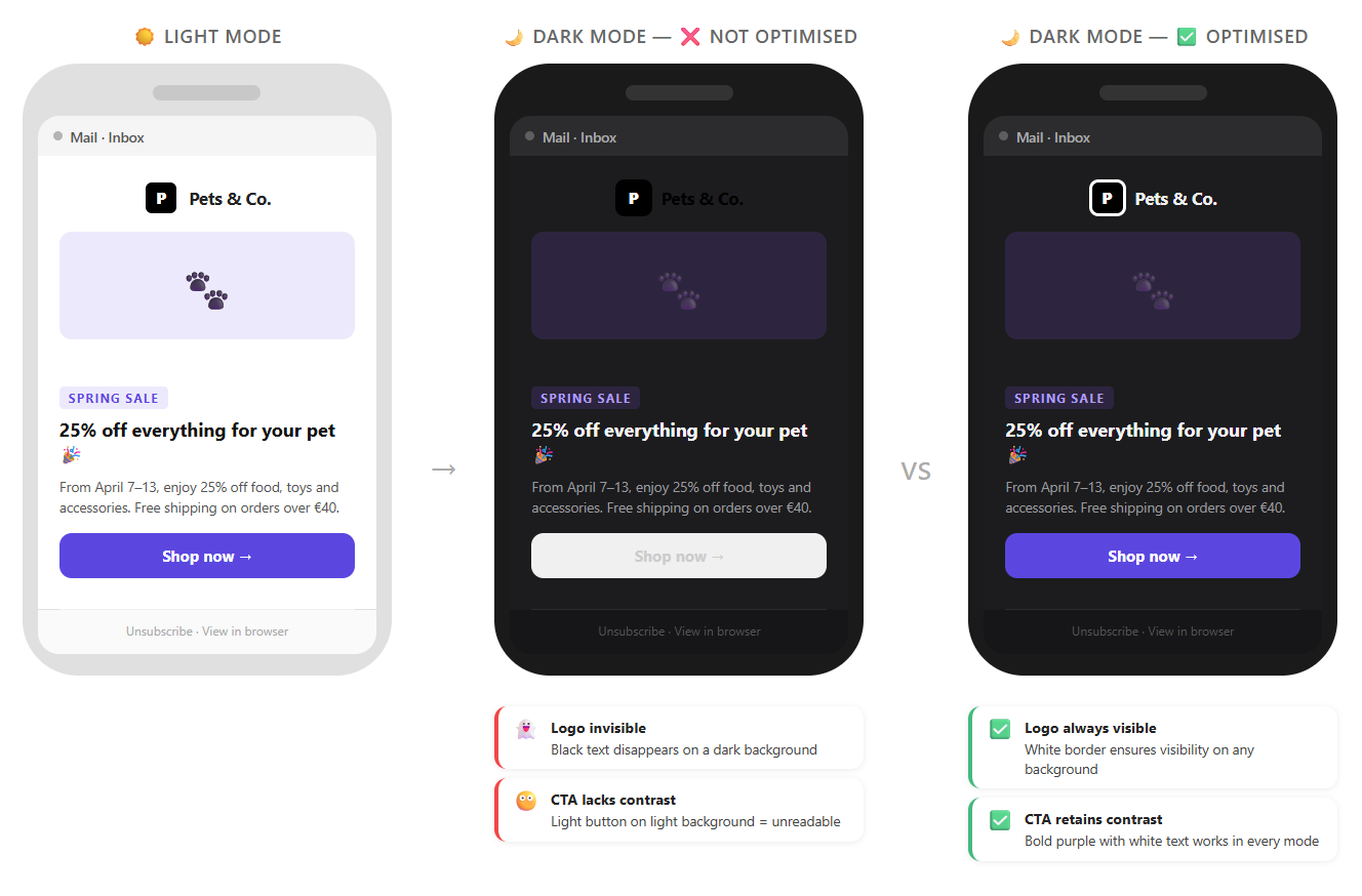
What exactly does dark mode do to your email?
In dark mode, the email client partially or fully inverts the colours of your email. A white background becomes dark grey or black, and dark text becomes light. That sounds straightforward, but in practice it often leads to unexpected results: logos with a transparent background that suddenly disappear, or CTA buttons that lose their contrast.Tips for designing dark-mode-proof emails
- Use transparent PNGs for logos with dark text. Add a white border or background to your logo so it stays readable in every mode. Or use a version of your logo that also works on a dark background.
- Make sure your CTA buttons have sufficient contrast. Avoid colours that are too close to each other. A button with a bold background colour and white text will generally remain readable in dark mode as well.
- Test your emails in dark mode. Send a test email to yourself and enable dark mode on your phone or in your mail client. That way you'll immediately spot where things go wrong.
- Don't place critical images on a transparent background. Add an explicit background colour to your images or use a background block in your email structure.
Always mobile-first!
Optimising your emails for mobile is not a one-time task but an ongoing process. However, it’s definitely worth the effort! By continually improving and thinking mobile-first at every step, you create emails that are not only visually appealing but also truly work for your readers.Ultimately, the goal is for your campaign message to come across powerfully, no matter the screen it's viewed on. Keep testing, adjusting, and refreshing, so your emails remain fresh and relevant. Oh, and scannable, of course! This way, you’ll keep your readers engaged and excited!
Try it with Flexmail's builder
 Jasper Van Biesen